Oops! Sorry!!


This site doesn't support Internet Explorer. Please use a modern browser like Chrome, Firefox or Edge.

Warlock Publishing

Coloring Techniques: Enhancing Stress Relief in Your Art

Diving into the world of coloring is like discovering a hidden oasis for stress relief—a tranquil escape often underestimated by adults. While it may have been brushed off as child's play in the past, recent studies have uncovered its profound ability to ease the burdens of stress. In a world where stress looms large, we're on the lookout for practical and readily available remedies, and coloring emerges as a surprising yet effective solution.

  • Eric Williams, Oct 2023 

  •  Coloring Techniques: Enhancing Stress Relief in Your Art

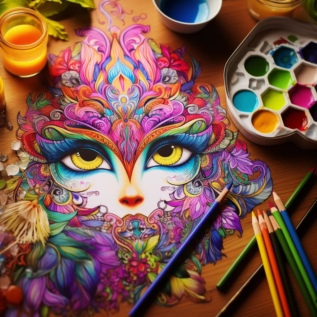
    The Science Behind Coloring

    The science behind coloring reveals how this simple activity can help relieve stress. Stress affects each person differently, impacting both mental and physical well-being. However, research shows that engaging in creative activities like coloring can have transformative effects on our stress levels.

    Coloring is more than just a casual pastime; it engages our brain in a unique way. When we color, our brains enter a state of focused concentration similar to meditation. This mental engagement allows distractions to fade away, providing a sense of calmness. The act of coloring also triggers the release of neurotransmitters that promote relaxation and tranquility.

    Moreover, coloring serves as a form of self-expression. Through the use of patterns and colors, we can channel our emotions and thoughts into visually captivating artwork. This creative outlet helps us address stress on a deeper level.

    The benefits of coloring extend beyond the mind and into the body. As we color, our muscles relax, heart rates stabilize, and physiological responses to stress find balance. It becomes a holistic remedy for addressing both the visible and invisible effects of stress.

    In this interplay between creativity and neuroscience, coloring becomes an avenue for reclaiming serenity in the face of life's challenges. It reduces stress levels, enhances emotional well-being, and brings about an overall sense of calmness.

    25 Coloring Techniques to Help Reduce Stress

    Abstract Expressionism: Release Stress Through Abstract, Free-Form Coloring Without Rigid Structure

    Abstract Expressionism:

    Abstract Expressionism is an art movement that emerged in the mid-20th century, characterized by spontaneous and non-representational forms of expression. Artists associated with this movement, such as Jackson Pollock and Willem de Kooning, often created large-scale works that emphasized gesture, emotion, and the act of painting itself. The style is known for its emphasis on individual creativity, freedom from traditional artistic conventions, and the use of bold colors and dynamic, gestural brushstrokes to convey a sense of energy and emotion. Abstract Expressionism played a significant role in shaping the development of modern art, emphasizing the artist's personal expression and the viewer's subjective interpretation.

    How Can Abstract Expressionism Be Used in Coloring?

    Abstract Expressionism can be translated into coloring as a liberating and expressive experience. Here's how you can incorporate Abstract Expressionist principles into your coloring:

    Free-Form Strokes: Instead of adhering to predefined shapes, let your coloring strokes flow freely. Allow your hand to move intuitively, creating dynamic and spontaneous patterns on the page.

    Bold Color Choices: Embrace vibrant and bold colors. Abstract Expressionism often relies on a rich and diverse color palette to convey emotion and energy, so don't shy away from using a wide range of hues.

    Gestural Mark-Making: Mimic the gestural brushstrokes of Abstract Expressionist painters. Use your coloring tools with bold and sweeping motions, creating dynamic and expressive lines across the page.

    Layering and Texture: Experiment with layering different colors to create depth and texture in your coloring. Abstract Expressionism often involves building up layers of paint, and you can replicate this effect with colored pencils, markers, or other coloring tools.

    Emotional Expression: Tap into your emotions while coloring. Abstract Expressionism is about conveying feelings and experiences through art, so let your coloring reflect your mood and emotions at the moment.

    Spontaneity: Allow for spontaneity in your coloring process. Don't overthink each stroke; instead, let the act of coloring become a fluid and instinctive expression of your creative energy.

    Large-Scale Format: If possible, work on a larger canvas or coloring page. Abstract Expressionism often involves large-scale works, and coloring on a bigger surface allows for more freedom and movement.

    Drips and Splatters: Channel the iconic drip paintings of artists like Jackson Pollock by incorporating controlled drips or splatters into your coloring. This adds an element of randomness and unpredictability.

    Mixing Mediums: Combine different coloring mediums—such as watercolor, markers, and colored pencils—to create a varied and textured effect reminiscent of the layered approach seen in Abstract Expressionist paintings.

    Personal Interpretation: Abstract Expressionism is about personal interpretation. Don't worry about creating a realistic representation; instead, focus on expressing your unique perspective and feelings through color and form.

    Chiaroscuro: Experiment With Light and Shadow, Exploring the Contrast Between Dark and Light Shades

    Chiaroscuro: Experiment With Light and Shadow, Exploring the Contrast Between Dark and Light Shades

    Chiaroscuro is an artistic technique that originated during the Renaissance and is characterized by the use of strong contrasts between light and dark to create a sense of volume and three-dimensionality in a two-dimensional artwork. The term, Italian for "light-dark," refers to the juxtaposition of illuminated areas against deep shadows. Artists employing chiaroscuro, such as Caravaggio, often utilized a single, concentrated light source to accentuate dramatic contrasts, adding a heightened sense of realism and emotional intensity to their paintings. This technique has since become a fundamental aspect of visual arts, influencing various styles and movements throughout history.

    How Can Chiaroscuro Be Used in Coloring?

    Chiaroscuro, with its emphasis on dramatic light and shadow contrasts, can be effectively applied to coloring, creating visually striking and dimensional effects.

    Light Source Awareness: Imagine a specific light source in your coloring scene. Be mindful of where the light hits and where shadows naturally fall. This awareness will guide your application of color.

    Contrasting Tones: Choose contrasting tones for light and shadow areas. Use lighter shades for illuminated sections and darker shades for areas in shadow. This creates a sense of depth and dimension in your coloring.

    Gradual Shading: Transition smoothly between light and dark areas. Gradual shading helps to blend tones seamlessly, contributing to a more realistic and visually appealing Chiaroscuro effect.

    Focus on Highlights: Identify the highlights in your coloring and use a lighter color or leave those areas untouched to represent the brightest points where the light directly hits the subject.

    Deep Shadows: Don't be afraid to go dark in your shadowed areas. Chiaroscuro relies on deep, rich shadows to create contrast, so embrace the darker end of your color spectrum for added drama.

    Limited Palette: Consider using a limited color palette to enhance the impact of Chiaroscuro. Simplifying your colors can emphasize the contrast between light and shadow.

    Contouring Lines: Integrate contouring lines to delineate the transitions between light and shadow. This technique adds definition and emphasizes the form of your colored subject.

    Texture Emphasis: Use Chiaroscuro to highlight texture in your coloring. The interplay of light and shadow can accentuate the surface qualities of your subject, adding realism and interest.

    Experiment with Backgrounds: Apply Chiaroscuro not only to your subject but also to the background. Creating a stark contrast between the subject and its surroundings can enhance the overall impact of your coloring.

    Reference Real-life Lighting: Study how light behaves in real-life scenarios. Observing photographs or objects in various lighting conditions will provide insights into how to effectively apply Chiaroscuro to your coloring.

    Color-by-Number: Embrace Structure With a Color-Coded Guide, Allowing for a Relaxing and Organized Experience

    Color-by-Number: Embrace Structure With a Color-Coded Guide, Allowing for a Relaxing and Organized Experience

    Color by Numbers is a coloring activity where each color is assigned a specific number or code, and a corresponding coloring sheet has sections marked with these numbers. Participants follow the provided key, filling in the areas with the designated colors according to the associated numbers. This method simplifies the coloring process, making it more accessible for individuals of various ages and skill levels. It combines creativity with a structured approach, offering a guided and organized way to create colorful and visually appealing artworks. Color by Numbers is often used in educational settings and as a leisure activity, providing a relaxing and enjoyable experience.

    How Can Color by Numbers Be Used in Coloring?

    Color by Numbers can be a fun and structured approach to coloring, suitable for all ages. Here's how you can make the most of Color by Numbers in your coloring endeavors:

    Accessible for All Ages: Color by Numbers is accessible to both children and adults, making it a versatile coloring option for various age groups.

    Skill Development: For beginners, it serves as a great introduction to coloring and helps develop fine motor skills, hand-eye coordination, and color recognition.

    Stress Relief: The structured nature of Color by Numbers provides a calming and focused coloring experience, offering a mindful and stress-relieving activity.

    Educational Tool: It can be used as an educational tool for teaching numbers, colors, and sequencing, making it a valuable resource for parents and teachers.

    Quick and Convenient: Color by Numbers is a quick and convenient way to enjoy coloring without the need for extensive planning or artistic skills.

    Guided Creativity: While the numbers provide guidance, there's still room for creativity within the designated color choices. Experiment with shading or try variations in color intensity to add a personal touch.

    Group Activities: Ideal for group activities or social settings, where participants can enjoy coloring together, compare their creations, and engage in a shared experience.

    Art Therapy: It can be used in art therapy settings, offering individuals a structured and soothing way to express themselves through color.

    Themed Coloring: Explore a variety of themed Color by Numbers sheets, ranging from landscapes and animals to abstract designs, catering to different interests and preferences.

    Customization: For those feeling more adventurous, take a traditional Color by Numbers sheet and modify the color choices, creating a unique and customized version of the artwork.

    Killer Pumpkins: Adult Halloween Coloring Book

    "Dive into the dark and whimsical world of 'Killer Pumpkins: An Adult coloring Book.' Unleash your creativity and color outside the lines of convention with this unique adult coloring experience."

    Order Now!

    Collage Coloring: Combine Coloring With Collage Elements for a Multi-Dimensional and Artistic Approach

    Collage Coloring: Combine Coloring With Collage Elements for a Multi-Dimensional and Artistic Approach

    Collage Coloring is a creative technique that combines coloring with the art of collage. In this approach, individuals incorporate collage elements into their coloring projects, blending two artistic methods into a harmonious composition. Artists can use a variety of materials, such as cut-out images, textured paper, fabric, or other mixed-media elements, and integrate them seamlessly with their coloring designs. Collage Coloring allows for a dynamic interplay between different textures, patterns, and colors, resulting in unique and visually engaging artworks that go beyond traditional coloring boundaries. This technique offers a versatile and expressive way to experiment with diverse materials while adding an extra layer of creativity to the coloring process.

    How Can Collage Coloring Be Used in Coloring?

    Collage Coloring adds an extra layer of creativity to traditional coloring by integrating various materials into the artwork. Here's how you can use Collage Coloring in your coloring endeavors:

    Material Variety: Experiment with a variety of materials such as textured paper, fabric, magazine cut-outs, or even recycled materials to incorporate into your coloring projects.

    Themed Creations: Tailor your Collage Coloring to fit a specific theme or mood, selecting materials that enhance and complement your chosen coloring palette.

    Mixed-Media Exploration: Embrace the fusion of coloring with mixed media. Combine colored pencils, markers, or crayons with collaged elements to create a visually rich and textured masterpiece.

    Layering Techniques: Use collage elements to add depth and dimension to your coloring. Layer materials strategically to create visually interesting and dynamic compositions.

    Interactive Storytelling: Tell a visual story through your collage by selecting images or symbols that convey a narrative. Blend these with your coloring choices to enhance the storytelling aspect.

    Personal Expression: Incorporate personal elements into your Collage Coloring, such as photographs, quotes, or symbols that hold significance to you, making your artwork uniquely expressive.

    Texture Play: Experiment with the tactile aspect of Collage Coloring. The juxtaposition of different textures can create a sensory experience, adding an extra layer of interest to your artwork.

    Group Projects: Engage in collaborative Collage Coloring projects with friends or family. Each participant can contribute different collage elements, resulting in a collective and diverse artwork.

    Art Journaling: Use Collage Coloring in your art journaling practice. Combine written thoughts, sketches, and collaged materials to create visually captivating and reflective pages.

    Upcycling Art: Embrace an eco-friendly approach by incorporating upcycled materials into your collages. Use old magazines, fabric scraps, or packaging materials to create sustainable and unique coloring compositions.

    Contrast Play: Experiment With High-Contrast Combinations To Stimulate Visual Interest and Focus

    Contrast Play: Experiment With High-Contrast Combinations To Stimulate Visual Interest and Focus

    Contrast Play is an artistic technique that involves the intentional use of stark differences, such as color, light, shape, or texture, to create visual impact and emphasis within an artwork. This approach relies on the dynamic interplay between elements that stand out distinctly from one another, highlighting their differences to draw attention and evoke a strong visual response. Contrast Play can be applied in various art forms, including drawing, painting, and coloring, to enhance the overall composition and create a compelling and visually engaging result.

    How Can Contrast Play Be Used in Coloring?

    Contrast Play can bring vibrancy and visual interest to your coloring projects. Here's how you can use Contrast Play in your coloring endeavors:

    Color Intensity: Experiment with highly contrasting colors, pairing bold and vibrant hues with their opposites on the color wheel to create striking visual impact.

    Light and Dark: Emphasize contrast by playing with light and dark shades. Combine deep, rich colors with lighter tones to create a dynamic interplay that enhances the sense of depth and dimension in your coloring.

    Background vs. Foreground: Introduce contrast by coloring the background and foreground with distinct colors or tones. This helps the main subject stand out prominently against its surroundings.

    Texture Variation: Explore contrast through different coloring techniques. Combine smooth, even coloring with textured or stippled areas to add variation and intrigue to your artwork.

    Patterned Elements: Integrate contrasting patterns into your coloring. For example, create a background with intricate patterns and overlay it with a solid-colored focal point to make it pop.

    Size and Scale: Experiment with contrasting sizes and scales of elements within your coloring. This can add a sense of drama and interest to the overall composition.

    Complementary Colors: Utilize complementary color pairs to create strong visual contrast. Colors like red and green or blue and orange intensify each other when placed side by side.

    Temperature Contrast: Play with warm and cool colors to create a visual temperature contrast. This adds a dynamic and harmonious element to your coloring.

    Color Blocking: Create distinct color blocks within your coloring, allowing each section to stand out independently. This minimalist approach can be both visually impactful and modern.

    Detail Emphasis: Enhance contrast by adding intricate details to specific areas of your coloring. This draws attention to those details and creates a focal point within the overall composition.

    Cross-Hatching: Develop Depth and Texture by Layering Intersecting Lines, Engaging the Mind in a Focused Manner

    Cross-Hatching: Develop Depth and Texture by Layering Intersecting Lines, Engaging the Mind in a Focused Manner

    Cross-hatching is a drawing and shading technique that involves creating a series of intersecting lines to build up texture, tone, and shadow in an artwork. The lines can be closely spaced or more open, depending on the desired effect. By varying the density and direction of the lines, artists achieve a range of values and create the illusion of depth and form. Cross-hatching is commonly used in pen and ink drawings, pencil sketches, and other linear mediums to add dimension and detail to an image.

    How Can Cross-Hatching Be Used in Coloring?

    Cross-hatching can be adapted for coloring, bringing depth and texture to your artwork. Here's how you can use Cross-Hatching in your coloring projects:

    Pencil Cross-Hatching: Use colored pencils to apply cross-hatching for shading. Vary the pressure and direction of your pencil strokes to create different tones and textures.

    Marker Cross-Hatching: Experiment with markers by layering cross-hatched strokes. Overlapping lines with different colors can produce rich and nuanced shades.

    Pen Cross-Hatching: Incorporate fine-tipped colored pens to add intricate cross-hatching details. This is particularly effective for smaller areas or when emphasizing specific features.

    Variation in Stroke Length: Play with the length of your cross-hatched strokes. Shorter strokes can create a denser, darker effect, while longer strokes provide a more open and subtle shading.

    Layering Techniques: Apply cross-hatching in layers. Start with a base layer of color and gradually build up intensity by adding more cross-hatched strokes.

    Directional Changes: Experiment with the direction of your cross-hatching. Changing the angles of your strokes adds complexity and interest to your coloring, especially when working on larger areas.

    Combining with Other Techniques: Integrate cross-hatching with other coloring techniques, such as blending or gradient shading, to create a dynamic and multi-dimensional effect.

    Highlight and Shadow: Use cross-hatching to emphasize areas of highlight and shadow in your coloring. This technique can enhance the three-dimensional quality of your artwork.

    Contouring: Apply cross-hatching to define contours and edges. This helps in outlining shapes and giving a sense of form to your colored illustrations.

    Texture Creation: Utilize cross-hatching to introduce textures into your coloring. Whether it's the texture of fabric, wood, or other surfaces, this technique can add a tactile feel to your artwork.

    Rustic Retreats: Log Cabin Coloring Book

    Embrace the cozy charm of log cabins with "Rustic Retreats: Log Cabin Coloring Book," a delightful adult coloring experience that transports you to the heart of nature's tranquility and rustic elegance.

    Order Now!

    Doodle Borders: Frame Your Coloring With Intricate Doodles, Promoting a Sense of Containment and Order

    Doodle Borders: Frame Your Coloring With Intricate Doodles, Promoting a Sense of Containment and Order

    Doodle Borders involve creating freeform, hand-drawn patterns and designs along the edges of an artwork or around specific elements. These doodles are typically whimsical, spontaneous, and characterized by playful shapes, swirls, and intricate details. Doodle Borders can be used to frame and enhance the visual appeal of a composition, adding a touch of creativity and personal expression to the edges of a page or around the perimeter of an illustration. This technique is popular in various artistic endeavors, including coloring, journaling, and decorative art, offering a fun and imaginative way to embellish and complete a visual piece.

    How Can Doodle Borders Be Used in Coloring?

    Doodle Borders can add a delightful and personalized touch to your coloring projects. Here's how you can incorporate Doodle Borders into your coloring endeavors:

    Frame Your Artwork: Use Doodle Borders to frame your colored illustration. Create a whimsical or intricate border around the edges, adding a decorative touch that enhances the overall presentation.

    Accentuate Key Elements: Draw Doodle Borders around specific elements or focal points in your coloring. This can draw attention to certain areas and create a sense of cohesion within the artwork.

    Create a Theme: Develop a thematic Doodle Border that complements the subject of your coloring. For example, if you're coloring a nature scene, incorporate doodles of leaves, flowers, or vines into the border.

    Expressive Outlines: Instead of a traditional solid border, use Doodle Borders to outline the edges of your coloring. This creates a dynamic and expressive outline that adds flair to your artwork.

    Incorporate Zentangle Patterns: Combine Doodle Borders with Zentangle-inspired patterns. Integrate repetitive and intricate designs along the borders to create a visually captivating and meditative effect.

    Personalized Patterns: Develop your own signature Doodle Borders. Whether it's incorporating your initials, favorite symbols, or unique shapes, this personalization adds a distinctive element to your coloring.

    Thick and Thin Lines: Experiment with varying line thickness in your Doodle Borders. This creates visual interest and can be especially effective when using different colors for the doodles.

    Interconnected Doodles: Connect different doodles to form a continuous border pattern. This creates a seamless and flowing design that wraps around your coloring.

    Negative Space Doodling: Instead of drawing directly on the border lines, use Doodle Borders to create patterns within the negative space around the edges. This adds complexity and detail to the overall composition.

    Colorful Doodles: Infuse color into your Doodle Borders. Experiment with using different colors for the doodles, coordinating them with the main coloring or introducing contrasting hues for a vibrant effect.

    Emotional Color Mapping: Assign Colors to Emotions, Creating a Visual Representation of Your Emotional Landscape

    Emotional Color Mapping: Assign Colors to Emotions, Creating a Visual Representation of Your Emotional Landscape

    Emotional Color Mapping involves assigning specific colors to different emotions or feelings, creating a visual representation of one's emotional landscape. This technique allows individuals to express and explore their emotions through the use of color, turning abstract feelings into a tangible and colorful representation. Emotional Color Mapping can be a therapeutic and introspective exercise, providing a unique way to communicate and understand one's emotional state through the creation of a visual map that reflects the intricate nuances of mood and sentiment.

    How Can Emotional Color Mapping Be Used in Coloring?

    Emotional Color Mapping can be a deeply personal and therapeutic approach to coloring, allowing you to express and explore your emotions visually. Here's how you can incorporate Emotional Color Mapping into your coloring projects:

    Identify Emotions: Begin by reflecting on your current emotional state and identifying specific emotions you want to express. Consider a range of feelings, from joy and calmness to sadness or excitement.

    Assign Colors: Associate specific colors with each emotion you've identified. Choose colors intuitively, based on personal associations or cultural symbolism. For example, you might connect blue with calmness or yellow with joy.

    Create a Key: Develop a key or legend that indicates which colors correspond to specific emotions. This serves as a reference guide for your Emotional Color Mapping.

    Color Zones: Divide your coloring page into different zones or sections, each representing a different aspect of your emotional landscape. Apply the colors from your key to these zones based on the corresponding emotions.

    Blend and Transition: Use blending techniques to transition between colors, representing the nuanced and complex nature of emotions. This can involve gradient blending, layering, or incorporating intermediary hues.

    Experiment with Intensity: Adjust the intensity or saturation of colors to reflect the strength or subtlety of your emotions. Vibrant, bold colors might represent intense feelings, while softer shades convey more subdued emotions.

    Incorporate Symbols: Integrate symbols or doodles that hold personal significance for each emotion. These symbols can enhance the emotional storytelling within your coloring.

    Mindful Coloring: Engage in mindful coloring as you fill each zone with its corresponding color. Focus on the sensations and emotions associated with each color as you work through the page.

    Journal Accompaniment: Pair your Emotional Color Mapping with journaling. Write down thoughts or descriptions of each emotion and the colors chosen, creating a comprehensive and reflective emotional diary.

    Revisit and Reflect: Periodically revisit your Emotional Color Mapping to see how your emotional landscape evolves over time. This can provide insights into patterns, shifts, and the ongoing exploration of your feelings through coloring.

    Geometric Patterns: Explore the Therapeutic Repetition of Geometric Shapes for a Meditative Experience.

    Geometric Patterns: Explore the Therapeutic Repetition of Geometric Shapes for a Meditative Experience.

    Geometric Patterns involve the use of precise, mathematical shapes and structures to create intricate and visually appealing designs. These patterns often include elements such as lines, circles, triangles, squares, and other geometric forms arranged in repetitive and symmetrical arrangements. Geometric Patterns are characterized by their order, symmetry, and precision, making them a versatile and popular choice in various art forms, including coloring. These patterns can range from simple and minimalist designs to complex and ornate arrangements, offering endless possibilities for creative expression.

    How Can Geometric Patterns Be Used in Coloring?

    Geometric Patterns provide a structured and visually engaging foundation for coloring projects. Here's how you can use Geometric Patterns in your coloring endeavors:

    Pattern Filling: Color the individual geometric shapes within the pattern with different hues. Experiment with various color combinations to create a vibrant and harmonious design.

    Contrasting Colors: Use contrasting colors for adjacent geometric shapes to emphasize the pattern's structure. This enhances the visual impact and creates a dynamic interplay between colors.

    Gradient Effects: Apply gradient coloring within each geometric shape. Transition from one color to another, creating a smooth and visually appealing gradient effect within the pattern.

    Negative Space Exploration: Leave certain areas of the pattern blank to create negative space. This adds a sense of balance and simplicity to your coloring, allowing the geometric shapes to stand out.

    Layering Techniques: Experiment with layering techniques to add depth to the pattern. Start with a base color and layer additional shades to create a three-dimensional effect within the geometric shapes.

    Color Harmony: Choose a cohesive color palette for the entire geometric pattern. This creates a sense of unity and harmony, making the overall design visually pleasing.

    Intricate Details: Enhance the intricacy of the geometric pattern by adding fine details, such as tiny dots, lines, or small shapes within each larger geometric element.

    Accentuate Outlines: Emphasize the outlines of the geometric shapes with a contrasting color or a darker shade. This adds definition to the pattern and highlights its structure.

    Personalized Color Schemes: Develop your own color schemes for geometric patterns, deviating from traditional color associations. This allows for personal expression and creativity in your coloring.

    Incorporate Metallics: Add a touch of glamour by incorporating metallic colors like gold, silver, or bronze to certain geometric elements. This brings a luxurious and eye-catching element to your coloring project.

    Defcon Goth! : Coloring the Futuristic Digital Domain

    Immerse yourself in a breathtaking fusion of cyberpunk, gothic, and steampunk aesthetics

    Order Now!

    Gradient Blending: Transition Colors Smoothly From Light to Dark, Creating a Calming Visual Flow.

    Gradient Blending: Transition Colors Smoothly From Light to Dark, Creating a Calming Visual Flow.

    Gradient Blending is a coloring technique that involves smoothly transitioning between different shades or colors to create a gradual shift in tone or hue. This technique is characterized by a seamless blend from one color to another, creating a visually appealing and harmonious transition. Gradient Blending is often used to add depth, dimension, and a sense of realism to artworks, allowing colors to flow seamlessly from light to dark or between different hues. This technique is versatile and can be applied in various art forms, including painting, drawing, and coloring, to achieve smooth and captivating color transitions.

    How Can Gradient Blending Be Used in Coloring?

    Gradient Blending can add depth and dimension to your coloring projects, creating smooth transitions between colors. Here's how you can incorporate Gradient Blending into your coloring:

    Selecting Colors: Choose a color palette for your gradient. This could be a monochromatic scheme, complementary colors, or any combination that you find visually appealing.

    Layering Colors: Start with the lightest color at one end of the area you're coloring and gradually transition to the darkest color on the opposite end. Apply each color in overlapping strokes to create a seamless blend.

    Circular Motion: Use a circular motion with your coloring tool to blend the colors smoothly. This technique helps avoid visible lines and creates a more gradual transition.

    Experiment with Pressure: Vary the pressure you apply to your coloring tool. Begin with lighter pressure when using the lighter color and gradually increase pressure as you move to the darker shade. This contributes to a natural gradient.

    Overlap Technique: Overlap colors slightly to facilitate the blending process. The overlapping areas create intermediary tones, enhancing the overall gradient effect.

    Consider Backgrounds: Apply Gradient Blending to background elements in your coloring. This technique can create atmospheric effects and add depth to the entire composition.

    Use Blending Tools: Some coloring mediums, like markers or colored pencils, come with blending tools or solutions. Experiment with these tools to achieve a smoother and more professional-looking gradient.

    Practice with Different Mediums: Gradient Blending can be applied with various coloring mediums, such as colored pencils, markers, or even watercolors. Each medium offers a unique texture and effect when blending.

    Directional Blending: Experiment with different directions of blending. You can create horizontal, vertical, or diagonal gradients, depending on the desired visual effect.

    Combine with Other Techniques: Integrate Gradient Blending with other coloring techniques, such as pattern filling or detailing. This combination enhances the overall complexity and visual interest of your coloring project.

    Ink Wash: Combine Ink With Water for a Fluid, Unpredictable Coloring Experience

    Ink Wash: Combine Ink With Water for a Fluid, Unpredictable Coloring Experience

    Ink Wash is a painting technique that involves diluting ink with water to create a range of subtle and expressive tones. This method is often characterized by its soft, translucent, and flowing appearance, allowing for a wide spectrum of grays and blacks. Artists use varying concentrations of ink and water to achieve different shades, and the technique is particularly well-suited for creating atmospheric and nuanced effects. Ink Wash is versatile and can be applied with brushes, sponges, or other tools, offering artists a dynamic and fluid way to convey depth and emotion in their artwork.

    How Can Ink Wash Be Used in Coloring?

    Ink Wash techniques can be adapted for coloring, offering a unique and expressive approach to your projects. Here's how you can use Ink Wash in coloring:

    Dilution Control: Experiment with diluting your ink to achieve different levels of transparency. This allows you to create a gradient effect or control the intensity of the color.

    Brush Techniques: Use various brush techniques to apply the ink wash. Explore stippling, hatching, or broad brush strokes to add texture and depth to your coloring.

    Layering: Apply multiple layers of ink wash to build up tones and create a richer, more complex coloring. Allow each layer to dry before adding the next to avoid blending the colors excessively.

    Negative Space: Leverage the transparency of ink wash to leave certain areas blank, creating negative space within your coloring. This adds visual interest and emphasizes the colored elements.

    Combining Colors: Mix different ink colors to create custom shades. Blend complementary colors for added vibrancy or experiment with analogous hues for a harmonious palette.

    Highlight and Shadow: Use varying concentrations of ink to create highlights and shadows within your coloring. This adds dimension and brings your artwork to life.

    Wet-on-Wet Technique: Apply the ink wash while the paper is still wet for a soft and diffused effect. This technique creates a dreamy, atmospheric quality in your coloring.

    Contouring: Emphasize contours and edges by using a fine brush and concentrated ink. This adds definition and enhances the form of your colored elements.

    Textured Surfaces: Experiment with different paper textures. The absorbency of the paper can impact the appearance of the ink wash, creating unique patterns and textures.

    Combining with Other Mediums: Integrate ink wash with other coloring mediums, such as colored pencils or markers. This combination allows for a mixed-media approach, combining the fluidity of ink wash with the precision of other tools.

    Mandala Coloring: Dive Into the Intricate World of Mandalas, Promoting Mindfulness and Concentration

    Mandala Coloring: Dive Into the Intricate World of Mandalas, Promoting Mindfulness and Concentration

    Mandala Coloring involves the intricate and symmetrical coloring of mandala designs, which are geometric patterns often arranged in a circular shape. Mandalas have spiritual and cultural significance in various traditions, representing wholeness, balance, and unity. Coloring mandalas is a meditative and creative practice that allows individuals to focus their attention, relieve stress, and express their artistic flair. Mandala Coloring typically involves a repetitive and rhythmic process, with each section of the design offering a canvas for different colors and patterns. The act of coloring a mandala is not only visually appealing but also serves as a therapeutic and mindful activity.

    How Can Mandala Coloring Be Used in Coloring?

    Mandala Coloring is a popular and therapeutic coloring practice that allows for creative expression and relaxation. Here's how you can make the most of Mandala Coloring in your coloring projects:

    Mindful Coloring: Approach Mandala Coloring as a mindful and meditative activity. Focus on each section, allowing the repetitive patterns to guide your attention and bring a sense of calm.

    Color Selection: Choose a color palette that resonates with your mood or intentions. Harmonious and soothing colors can enhance the meditative experience, while vibrant hues can bring energy and vitality to the mandala.

    Central Focus: Start coloring from the center of the mandala and work your way outward. This helps maintain a sense of balance and symmetry as you progress through the design.

    Gradient Coloring: Experiment with gradient coloring, transitioning from one color to another as you move from the center to the outer edges of the mandala. This creates a visually captivating effect.

    Pattern Variation: Explore different coloring patterns within the mandala. You can use one pattern for the entire design or switch between patterns for individual sections to add variety and interest.

    Themed Mandalas: Choose mandalas with specific themes that resonate with you. Whether it's nature, spirituality, or abstract designs, themed mandalas can enhance the overall coloring experience.

    Customization: Personalize your mandala by adding your own doodles, symbols, or small illustrations within the design. This makes each mandala a unique reflection of your creativity.

    Mixed Media: Combine different coloring mediums, such as colored pencils, markers, or gel pens, to add texture and depth to your mandala. The interplay of different materials can enrich the coloring experience.

    Frame Your Mandalas: Once you've completed a mandala, consider framing it. This not only preserves your artwork but also allows you to showcase your colorful creations as decorative pieces.

    Group Coloring: Engage in Mandala Coloring as a group activity. Coloring mandalas with friends or family can foster a sense of community and shared creativity, making it a social and enjoyable experience.

    ABDUCTIONS

    Adult coloring book for Alien Lovers

    Immerse yourself in a cosmic adventure like no other with our captivating adult coloring book

    Order Now!

    Metallic Accents: Add a Touch of Metallic Colors for a Touch of Glamour and Visual Interest

    Metallic Accents: Add a Touch of Metallic Colors for a Touch of Glamour and Visual Interest

    Metallic accents refer to the use of metallic colors or materials to add a shiny, reflective, and lustrous touch to an artwork. This technique involves incorporating metallic shades such as gold, silver, copper, or bronze to enhance specific elements within the composition. Metallic accents can be applied in various art forms, including coloring, painting, and crafting, and they often create a striking contrast when paired with traditional matte colors. This technique is valued for its ability to bring a sense of luxury, sophistication, and visual interest to an artwork, elevating it with a touch of metallic brilliance.

    How Are Metallic Accents Used in Coloring?

    Using Metallic Accents in coloring can add a touch of glamour and sophistication to your artwork. Here's how you can incorporate Metallic Accents into your coloring projects:

    Selecting Metallic Colors: Choose metallic shades such as gold, silver, copper, or bronze for specific elements of your coloring. These metallic hues can stand out against traditional matte colors.

    Highlighting Edges: Apply metallic colors to highlight the edges of objects or patterns within your coloring. This adds a reflective quality that draws attention to specific areas.

    Accentuating Details: Use metallic accents to accentuate intricate details or fine lines in your coloring. This technique enhances the precision and adds a touch of elegance to the overall composition.

    Combining with Matte Colors: Pair metallic accents with matte colors to create contrast and visual interest. For example, color the main elements in matte shades and use metallic colors for embellishments or focal points.

    Metallic Gel Pens: Utilize metallic gel pens for precise and controlled application of metallic accents. Gel pens allow for fine detailing, making them ideal for adding small metallic touches to your coloring.

    Blending Metallics: Experiment with blending metallic colors together to create gradients or subtle transitions. This technique can add depth and dimension to metallic elements in your coloring.

    Creating Texture: Apply metallic accents to create texture within your coloring. For example, use metallic colors to depict reflective surfaces like water or shiny objects in your artwork.

    Embossing with Metallic Powders: If you're working with colored pencils or other mediums, consider embossing specific areas with metallic powders. This adds a raised, textured effect and enhances the metallic shine.

    Metallic Backgrounds: Explore coloring metallic backgrounds to make certain elements pop. This can be especially effective for creating contrast and emphasizing central features in your artwork.

    Experiment with Metallic Markers: Use metallic markers for broader coverage and larger areas in your coloring. Metallic markers provide a smooth and vibrant application of metallic colors.

    Mindful Color Selection: Choose Colors Intentionally, Reflecting on the Emotions They Evoke As You Apply Them

    Mindful Color Selection: Choose Colors Intentionally, Reflecting on the Emotions They Evoke As You Apply Them

    Mindful Color Selection involves intentionally choosing colors for an artwork with awareness and consideration of their impact on emotions, mood, and overall aesthetic. This approach goes beyond random or impulsive color choices, encouraging a thoughtful and deliberate selection process. Mindful Color Selection takes into account the psychological and symbolic associations of colors, as well as the desired emotional or visual effect. It is often used in art therapy, mindfulness practices, and creative endeavors to enhance self-expression and the connection between the artist and their work.

    How Are Mindful Color Selection Used in Coloring?

    Mindful Color Selection in coloring involves a thoughtful and intentional approach to choosing colors that align with your emotions, intentions, or the overall theme of your artwork. Here's how you can apply Mindful Color Selection in your coloring projects:

    Reflect on Emotions: Before starting your coloring, take a moment to reflect on your current emotions or the mood you want to convey. Consider colors that resonate with these feelings, whether calming, energizing, or joyful.

    Symbolic Associations: Be mindful of the symbolic meanings associated with colors. Each color can evoke specific emotions or represent different concepts. Choose colors that align with the message or story you want to convey in your coloring.

    Color Wheel Exploration: Use the color wheel as a guide for complementary, analogous, or triadic color schemes. Mindfully select colors that harmonize well together, creating a visually pleasing and balanced composition.

    Create Harmony: Consider creating a harmonious color palette by choosing colors that are aesthetically pleasing when combined. This can involve selecting colors with similar tones or shades to create a cohesive and unified look.

    Mindful Blending: If you're blending colors, approach the process mindfully. Experiment with different blending techniques to achieve smooth transitions, paying attention to how each color interacts with the others.

    Intentional Contrasts: If you opt for contrasts, do so with intention. Mindfully choose colors that create a dynamic and visually interesting interplay. Contrasting colors can emphasize specific elements or evoke a particular mood.

    Nature-Inspired Colors: Draw inspiration from nature. Consider the colors found in landscapes, flowers, or the changing seasons. Mindful Color Selection based on nature can bring a sense of authenticity and organic beauty to your coloring.

    Personal Associations: Think about your personal associations with colors. Colors can have individual meanings and evoke memories or experiences. Incorporate colors that hold personal significance for you.

    Balance Warm and Cool Tones: Find a balance between warm and cool tones in your coloring. This balance can influence the overall atmosphere of your artwork, creating a sense of warmth, coolness, or neutrality.

    Experiment with Metallics: If applicable, be mindful of when and where you incorporate metallic accents. Consider the impact of reflective, metallic colors on the overall visual experience of your coloring.

    Monochromatic Harmony: Focus on a Single Color Scheme To Evoke a Sense of Simplicity and Calmness

    Monochromatic Harmony: Focus on a Single Color Scheme To Evoke a Sense of Simplicity and Calmness

    Monochromatic Harmony is a color scheme that involves using variations of a single color to create a cohesive and unified aesthetic in an artwork. In this approach, different shades, tones, and tints of the chosen color are utilized, resulting in a harmonious and visually pleasing composition. Monochromatic color schemes are known for their simplicity, elegance, and ability to evoke a sense of calm and balance. This harmonious use of a single color allows for a focused exploration of nuances within that color, creating depth and interest without the need for contrasting hues.

    How Can Abstract Expressionism Be Used in Coloring?How Can Monochromatic Harmony Be Used in Coloring?

    Monochromatic Harmony can be a sophisticated and visually appealing approach to coloring. Here's how you can use Monochromatic Harmony in your coloring projects:

    Color Selection: Choose a single base color for your monochromatic scheme. This can be any color you find visually appealing or one that aligns with the mood or theme of your artwork.

    Shades, Tones, and Tints: Explore the various shades, tones, and tints of your chosen color. Utilize darker shades for shadows, mid-tones for the main areas, and lighter tints for highlights. This creates depth and dimension within the monochromatic palette.

    Gradient Effects: Apply gradient coloring techniques within the monochromatic range. Transition smoothly from dark to light or experiment with variations in saturation to add visual interest.

    Highlighting Details: Use lighter or darker shades to highlight specific details within your coloring. This technique emphasizes certain elements and adds a focal point to your artwork.

    Background and Foreground: Experiment with using different shades of your chosen color for the background and foreground. This can create a subtle contrast while maintaining the overall monochromatic harmony.

    Texture and Pattern: Introduce texture and pattern within the monochromatic scheme. This can be achieved by varying the application technique or incorporating patterns that play with light and shadow.

    Limited Accent Colors: Consider incorporating a very limited number of accent colors that complement your monochromatic palette. These accents can draw attention to specific elements or details.

    Negative Space: Utilize negative space mindfully. Leaving certain areas blank or using a lighter tint can contribute to the overall balance and simplicity of the monochromatic composition.

    Experiment with Coloring Tools: Explore different coloring tools, such as colored pencils, markers, or watercolors, to see how each medium interacts with your chosen color. Each medium may offer unique textures and effects.

    Consistency in Theme: Maintain consistency in your chosen theme or subject matter. Whether it's nature, abstract shapes, or portraits, a monochromatic approach can tie together different elements within the same color palette, creating a cohesive visual narrative.

    Nature-Inspired Palette: Draw Inspiration From the Natural World, Incorporating Earthy Tones for Grounding

    Nature-Inspired Palette: Draw Inspiration From the Natural World, Incorporating Earthy Tones for Grounding

    A Nature-Inspired Palette refers to a color scheme drawn directly from the hues and tones found in the natural world. This palette often includes earthy tones, greens, blues, browns, and other colors reminiscent of landscapes, flora, and fauna. Nature-inspired color palettes evoke a sense of tranquility, connection to the environment, and visual harmony. These palettes can be used to bring the calming and grounding qualities of nature into various artistic endeavors, creating a timeless and organic aesthetic.

    How Can a Nature-Inspired Palette Be Used in Coloring?

    A Nature-Inspired Palette can bring a sense of serenity and natural beauty to your coloring projects. Here's how you can effectively use a Nature-Inspired Palette:

    Earth Tones: Incorporate earthy colors such as browns, greens, and warm neutrals. Use these tones to color elements like trees, rocks, or the ground in your artwork.

    Foliage Greens: Explore various shades of green to mimic the lush foliage found in nature. This can be applied to leaves, grass, or any greenery in your coloring.

    Sky and Water Blues: Use shades of blue for the sky, water, or other elements that evoke a sense of openness and tranquility. Experiment with different blues to capture the mood of various landscapes.

    Floral Hues: If your coloring involves flowers, draw inspiration from natural floral colors. Reds, pinks, purples, and yellows can add vibrancy and beauty to your artwork.

    Natural Gradients: Mimic natural gradients found in sunsets, sunrises, or landscapes. Blend warm and cool tones seamlessly to create a realistic and visually appealing effect.

    Seasonal Variation: Consider the season and adjust your palette accordingly. Use warm tones for autumn, cool blues and whites for winter, and fresh greens for spring.

    Texture and Detail: Pay attention to texture and detail in your coloring. Mimic the texture of tree bark, leaves, or other natural elements using your coloring techniques.

    Accent Colors: Introduce subtle accent colors inspired by nature. For example, a touch of soft lavender or warm ochre can add depth and interest to your artwork.

    Incorporate Natural Patterns: Draw inspiration from natural patterns such as the veins of leaves, ripples in water, or the intricate patterns on a butterfly's wing. Incorporate these patterns into your coloring.

    Balance Warm and Cool Tones: Achieve balance by blending warm and cool tones. This creates a harmonious and inviting atmosphere in your coloring, reminiscent of the diverse colors found in nature.

    Negative Space Embrace: Leave Certain Areas Blank To Appreciate the Power of Absence and Simplicity

    Negative Space Embrace: Leave Certain Areas Blank To Appreciate the Power of Absence and Simplicity

    Negative Space Embrace is an artistic concept that involves intentionally incorporating and celebrating the empty or uncolored areas within an artwork. Instead of focusing solely on coloring every available space, Negative Space Embrace emphasizes the deliberate use of uncolored sections to enhance the overall composition. This approach allows artists to embrace the beauty of emptiness, using the blank spaces strategically to create balance, contrast, and visual interest. Negative Space Embrace is not about neglecting areas but rather recognizing the significance of what is left untouched, letting it contribute meaningfully to the artistic expression.

    How Do You Use Negative Space Embrace in Coloring?

    Negative Space Embrace in coloring involves purposefully leaving certain areas uncolored to enhance the overall composition. Here's how you can effectively use Negative Space Embrace in your coloring projects:

    Strategic Blank Spaces: Identify areas within your coloring where leaving spaces blank would contribute to the overall design. These strategic blank spaces can create balance, draw attention, or emphasize specific elements.

    Enhance Contrast: Leave negative spaces around vibrant or dark-colored elements to enhance contrast. This technique adds visual impact and allows colored elements to stand out more prominently.

    Define Shapes: Use negative space to define shapes and forms within your coloring. This is particularly effective for creating silhouettes or highlighting the contours of objects.

    Highlight Details: Embrace negative space to highlight intricate details. By leaving areas blank around detailed elements, you draw attention to the precision and complexity of those specific features.

    Background Negative Space: Incorporate negative space in the background to create a sense of openness and balance. This can be especially effective in landscapes or scenes with expansive skies.

    Textured Negative Space: Experiment with negative space to suggest textures or patterns. For example, leaving certain areas uncolored can imply a textured surface, adding depth to your coloring.

    Negative Space as a Design Element: Treat negative space as a deliberate design element. Whether it's a deliberate pattern or an intentional gap between elements, negative space can contribute to the overall aesthetic.

    Balanced Composition: Use negative space to achieve a balanced composition. This can involve leaving some areas uncolored to counterbalance denser or more intricate sections of your coloring.

    Negative Space Patterns: Create patterns within negative space, such as dots, lines, or geometric shapes. This adds a layer of detail and interest to the uncolored areas, making them integral to the overall design.

    Mindful Application: Approach negative space with mindfulness. Consider the emotional and visual impact of leaving certain areas uncolored. Embrace negative space intentionally to convey specific moods or themes in your coloring.

    Sirens of the Deep: Adult Coloring Odyssey (Enchanted Realms : Coloring the Fantasy World)

    Sirens of the Deep

    Are you ready to embark on an enchanting journey beneath the waves, where captivating sirens beckon you into their world of mystery and melody?

    Order Now!

    Personal Symbolism: Infuse Your Coloring With Symbols That Hold Personal Significance, Creating a Meaningful Experience

    Personal Symbolism: Infuse Your Coloring With Symbols That Hold Personal Significance, Creating a Meaningful Experience

    Personal Symbolism is the use of symbols that hold personal meaning and significance to an individual within their creative expression. These symbols can be images, objects, or motifs that carry specific memories, emotions, or experiences unique to the creator. Personal Symbolism allows for a deeply personalized form of communication through art, where the artist imbues their work with layers of personal narrative and significance. These symbols might not have universal meanings but rather are rich with the individual's history, beliefs, and emotions, creating a profound and intimate connection between the artist and their creation.

    How Do You Use Personal Symbolism in Coloring?

    Using Personal Symbolism in coloring allows you to infuse your artwork with layers of personal meaning and significance. Here's how you can incorporate Personal Symbolism into your coloring projects:

    Identify Personal Symbols: Begin by identifying symbols that hold personal meaning for you. These could be objects, shapes, or images that evoke specific memories, emotions, or aspects of your identity.

    Integrate Symbols in the Composition: Incorporate your personal symbols into the coloring composition. Choose areas where these symbols can seamlessly fit within the design, enhancing the overall narrative of your artwork.

    Color Symbolic Elements: Pay attention to the colors you use for your personal symbols. Colors often carry their own symbolism, so choose hues that resonate with the emotions or meanings associated with your chosen symbols.

    Create Symbolic Patterns: Use personal symbols to create patterns within your coloring. This adds a layer of complexity and depth to your artwork while reinforcing the significance of the symbols.

    Symbolic Placement: Consider the placement of your personal symbols within the composition. Placing them strategically can draw attention to specific areas, creating focal points within your coloring.

    Symbolic Background Elements: If appropriate, incorporate your personal symbols into background elements. This can add subtle details and contribute to the overall theme of your coloring.

    Combine with Narrative Elements: Integrate personal symbols into a larger narrative or story within your coloring. This allows your artwork to convey a personal message or reflect specific experiences.

    Layering of Symbols: Experiment with layering multiple personal symbols. This can create visual interest and convey a more nuanced and intricate personal narrative.

    Personal Color Associations: Consider if specific colors are associated with your personal symbols. The combination of both the symbol and its associated colors can amplify the emotional impact of your coloring.

    Reflective Coloring: Approach the coloring process with reflection on the personal meanings behind each symbol. Allow your emotions and memories to guide your color choices, creating a truly meaningful and authentic artwork.

    Pointillism: Use Tiny Dots To Build Up Color and Texture, Fostering Focus and Patience

    Pointillism: Use Tiny Dots To Build Up Color and Texture, Fostering Focus and Patience

    Pointillism is a painting technique that emerged in the late 19th century, primarily associated with the Neo-Impressionist movement. This method involves creating an image by applying small, distinct dots of color to the canvas or surface, rather than using traditional brushstrokes. The viewer's eyes then blend these dots of color optically, creating a cohesive and vibrant image from a distance. Pointillism is characterized by its meticulous and systematic approach to color application, as artists carefully select and place each individual dot to achieve the desired visual effect. This technique imparts a unique texture and luminosity to the artwork, and it is celebrated for its innovative approach to color theory and optical perception. Notable artists associated with Pointillism include Georges Seurat and Paul Signac

    How Is Pointillism Used in Coloring?

    Pointillism can be adapted for coloring, offering a unique and intricate way to create vibrant and visually appealing artwork. Here's how you can use Pointillism in your coloring projects:

    Choose a Limited Color Palette: Select a limited color palette for your Pointillism coloring. This can enhance the impact of individual dots and contribute to the overall harmony of the artwork.

    Use Fine-Tipped Coloring Tools: Opt for fine-tipped coloring tools such as markers, colored pencils, or gel pens. These tools allow for precise application of individual dots, mimicking the Pointillist technique.

    Create a Base Sketch: Start with a light sketch of your subject or design. This provides a guide for where to place your dots and ensures that the overall composition remains cohesive.

    Experiment with Dot Sizes: Vary the size of your dots to add texture and depth to your coloring. Use smaller dots for finer details and larger dots for broader areas, creating a dynamic visual effect.

    Color Layering: Experiment with layering colors through the application of dots. Overlapping dots of different colors can create new shades and contribute to the optical blending characteristic of Pointillism.

    Consider Dot Density: Control the density of dots in different areas of your coloring. Concentrate dots more densely in areas where you want to emphasize details or add shading.

    Create Gradations: Achieve gradations and smooth transitions by gradually changing the color or density of dots. This technique allows you to capture nuances in tone and form.

    Build Up Texture: Use Pointillism to build up texture within your coloring. This is particularly effective for creating textured surfaces like fur, foliage, or rough terrain.

    Negative Space Utilization: Embrace negative space by leaving certain areas uncolored. This can create contrast and draw attention to specific elements in your Pointillism coloring.

    Experiment with Backgrounds: Apply the Pointillist technique to background elements as well. This can add depth and atmosphere to your coloring, making the entire composition visually engaging.

    Remember to approach Pointillism in coloring with patience and attention to detail, as the cumulative effect of carefully placed dots contributes to the overall success of the artwork

    Stippling: Create Images Using Small, Precise Dots, Promoting a Methodical and Calming Approach

    Stippling: Create Images Using Small, Precise Dots, Promoting a Methodical and Calming Approach

    Stippling is a drawing and painting technique characterized by the creation of images through the use of small, individual dots. Artists apply these dots in a systematic and controlled manner to build up tones, shades, and textures within an artwork. The density, size, and arrangement of the dots contribute to the overall visual effect. Stippling allows for precise control over light and shadow, and it is often used to achieve a wide range of tones and details. This technique can be time-consuming but results in intricate and visually captivating artworks. Stippling is commonly employed in both black and white and color illustrations, offering a versatile method for creating depth and complexity.

    How Stippling Is Used in Coloring?

    Fine-Tipped Coloring Tools: Choose fine-tipped coloring tools such as markers, colored pencils, or gel pens. These tools allow for precise application of individual dots, mimicking the stippling technique.

    Create a Base Sketch: Begin with a light sketch of your subject or design. This serves as a guide for where to place the stippled dots and ensures that the overall composition remains cohesive.

    Controlled Dot Placement: Apply stippled dots in a systematic and controlled manner. Vary the density, size, and spacing of the dots to create different tones, shadows, and highlights.

    Consider Dot Size: Experiment with varying the size of your stippled dots. Larger dots can be used for broader areas, while smaller dots are ideal for adding fine details and intricacies.

    Gradual Tone Building: Build up tones gradually by adjusting the density of stippled dots. Concentrate dots more densely in shadowed areas and space them out for lighter tones, creating a smooth transition.

    Texture Creation: Use stippling to create textures within your coloring. This technique is effective for simulating textures such as fur, fabric, or rough surfaces. Vary the density and arrangement of dots to convey different textures.

    Color Layering: Apply stippling with different colors to achieve color blending and shading. Overlapping stippled dots of various colors can create new shades and contribute to the overall vibrancy of your coloring.

    Negative Space Utilization: Leave certain areas uncolored to embrace negative space. This adds contrast and allows certain elements to stand out, enhancing the visual impact of your stippling.

    Precision in Detailing: Use stippling for precise detailing in specific areas of your coloring. This technique allows for intricate and detailed work, making it suitable for capturing fine details in portraits or intricate patterns.

    Experiment with Backgrounds: Extend the stippling technique to background elements in your coloring. This adds depth and complexity to the entire composition, making it visually rich and engaging.

    Approach stippling with patience and attention to detail, as the cumulative effect of carefully placed dots contributes to the overall success of the stippled coloring.

    Symmetry Exploration: Create Symmetrical Designs, Engaging Both Hemispheres of the Brain for Balance

    Symmetry Exploration: Create Symmetrical Designs, Engaging Both Hemispheres of the Brain for Balance

    Symmetry Exploration in art involves the intentional exploration and utilization of symmetry as a fundamental design element. Symmetry is the balanced arrangement of shapes, forms, or colors on one or both sides of an imaginary central axis. Artists use symmetry to create visually harmonious and aesthetically pleasing compositions. Symmetry Exploration goes beyond the conventional understanding of symmetry and encourages artists to experiment with different types of symmetry, such as radial, bilateral, and translational symmetry. This exploration allows for the creation of intricate and captivating designs that play with the viewer's perception and contribute to the overall impact of the artwork.

    How Is Symmetry Exploration Used in Coloring?

    Symmetry Exploration in coloring involves deliberately incorporating various forms of symmetry to enhance the visual appeal and balance of your artwork. Here's how you can use Symmetry Exploration in your coloring projects:

    Bilateral Symmetry: Create coloring designs with bilateral symmetry, where one side mirrors the other. This classic form of symmetry adds balance and order to your artwork.

    Radial Symmetry: Experiment with radial symmetry, where elements radiate outward from a central point. This creates dynamic and visually engaging compositions, often found in mandala designs.

    Translational Symmetry: Explore translational symmetry by repeating and translating elements across the composition. This technique adds a sense of continuity and flow to your coloring.

    Asymmetrical Balance: Play with asymmetry within a symmetrical framework. Intentionally deviate from perfect symmetry to add visual interest and a touch of uniqueness to your coloring.

    Reflectional Symmetry: Utilize reflectional symmetry to create mirror images across a central axis. This technique is effective for intricate and detailed designs, allowing you to replicate patterns with precision.

    Color Symmetry: Apply symmetry not only in shapes but also in color distribution. Ensure that colors are balanced and harmonious on both sides of the symmetrical axis.

    Negative Space Symmetry: Explore symmetry in negative space by leaving certain areas uncolored. This can contribute to the overall balance and aesthetic appeal of your coloring.

    Layered Symmetry: Experiment with layered symmetry, where different elements or patterns exhibit various symmetrical properties. This adds complexity and depth to your coloring.

    Geometric Symmetry: Use geometric shapes to create symmetrical patterns. Experiment with circles, squares, triangles, and other shapes to achieve precise and visually pleasing symmetry.

    Personal Symbol Symmetry: Incorporate personal symbols or motifs in a symmetrical arrangement. This adds a layer of personal meaning and significance to the overall symmetry of your coloring.

    Approach Symmetry Exploration in coloring with creativity and a willingness to experiment. Whether you prefer perfect symmetry or want to introduce variations, the exploration of symmetry can lead to visually stunning and harmonious coloring compositions.

    Texture Exploration: Experiment With Different Stroke Techniques To Create Varied Textures on the Page

    Texture Exploration: Experiment With Different Stroke Techniques To Create Varied Textures on the Page

    Texture Exploration in art involves the intentional investigation and incorporation of various textures within an artwork to add depth, visual interest, and tactile qualities. Artists use different techniques and materials to create textures, ranging from rough and gritty surfaces to smooth and velvety finishes. Texture Exploration allows for a multisensory experience, inviting viewers to engage with the artwork on both a visual and tactile level. This exploration can include experimenting with brushstrokes, layering techniques, and the use of various mediums to achieve a diverse range of textures, contributing to the overall richness and complexity of the artistic composition.

    How Is Texture Exploration Used in Coloring?

    Texture Exploration in coloring involves purposefully incorporating a variety of textures to enhance the visual and tactile qualities of your artwork. Here's how you can use Texture Exploration in your coloring projects:

    Layering with Colored Pencils: Experiment with layering colored pencils to create different textures. Apply varying pressure and use different blending techniques to achieve smooth gradients or textured effects.

    Use of Textured Paper: Choose textured paper as your coloring surface. The texture of the paper itself can add depth and interest to your artwork, influencing how colors interact and creating a tactile experience.

    Embossing Techniques: Explore embossing techniques to create raised textures on your coloring. Use embossing tools or stencils to add patterns or intricate details to specific areas of your artwork.

    Collage Elements: Integrate collage elements into your coloring. This can include textured materials such as fabric, paper, or even natural elements like leaves. Gluing these elements onto your coloring adds both visual and tactile texture.

    Brushstroke Variation: Experiment with different brushstroke techniques if you're using markers or watercolors. Create textures by varying the pressure, direction, and density of your brushstrokes.

    Texture Mediums: Utilize specialty texture mediums designed for coloring. These can include products like texture gels or pastes that, when applied, create raised textures on your coloring.

    Scraping Techniques: Try scraping techniques with colored pencils or pastels. Use a scraping tool to remove some of the colored pigment, revealing the paper underneath and creating unique textures.

    Sgraffito Method: Apply the sgraffito method by scratching or etching into layers of colored pencil or pastel to expose different colors or the paper surface. This adds a textured and dynamic element to your coloring.

    Experiment with Watercolor Washes: If using watercolors, explore different watercolor wash techniques. Wet-on-wet applications can create organic and unpredictable textures, while controlled washes offer smoother effects.

    Incorporate Texture Patterns: Introduce texture patterns into your coloring design. This can include patterns that mimic wood grain, fabric textures, or other intricate details that enhance the tactile and visual aspects of your artwork.

    Texture Exploration in coloring is about embracing diversity and incorporating a variety of techniques and materials to create a multisensory experience in your artwork. Whether subtle or bold, textures can add layers of complexity and interest to your coloring projects.

    Watercolor Wash: Apply Watercolor Techniques for a Soothing, Flowing Effect on the Page

    Watercolor Wash: Apply Watercolor Techniques for a Soothing, Flowing Effect on the Page

    A Watercolor Wash is a painting technique where watercolor paint is applied in a thin, translucent layer over a large area to create a smooth, even, and often gradient-like effect. The technique involves diluting the watercolor paint with water to achieve a range of values, from light to dark. Artists typically apply the wash in broad strokes, allowing the paint to flow and blend naturally on the paper.

    Watercolor washes can be used to establish backgrounds, skies, or large expanses of color in various artworks, and they are valued for their ability to create a soft and ethereal atmosphere. The level of watercolor wash transparency can be adjusted by controlling the paint-to-water ratio, offering versatility in achieving different visual effects.

    How Is Watercolor Wash Used in Coloring?

    Watercolor Wash can be adapted for coloring, bringing a fluid and expressive quality to your artwork. Here's how you can use Watercolor Wash in your coloring projects:

    Choose Watercolor Markers or Pencils: Opt for watercolor markers or pencils that can be activated with water. These tools allow you to achieve the watercolor wash effect while maintaining control over the application.

    Select Quality Watercolor Paper: Use watercolor paper or thick mixed-media paper that can withstand water application without warping. The paper's texture can also enhance the watercolor wash effect.

    Activate with Water: Apply the watercolor medium to the paper and activate it with water. This can be done by either using a wet brush to pick up pigment from watercolor pencils or markers, or by applying water directly to the paper before adding the watercolor.

    Experiment with Wet-on-Wet Technique: Explore the wet-on-wet technique by applying the watercolor to a wet surface. This allows colors to blend seamlessly and creates soft transitions, ideal for backgrounds or expansive areas.

    Layering for Depth: Build up layers of watercolor wash to achieve depth and intensity. Allow each layer to dry before applying the next to avoid muddying the colors.

    Gradient Effects: Create gradient effects by varying the concentration of pigment. Start with a more concentrated color at one end and gradually dilute it as you move across the paper, creating a smooth transition.

    Masking Techniques: Use masking techniques to preserve areas of the paper and create defined shapes or highlights within the watercolor wash. Masking fluid or removable tape can be applied before adding the wash.

    Embrace Imperfections: Watercolor washes often have a spontaneous and unpredictable quality. Embrace any natural variations, drips, or blends that occur during the application process.

    Combination with Other Techniques: Combine watercolor wash with other coloring techniques, such as detailed line work or textured elements, to create a dynamic and visually interesting composition.

    Consider Negative Space: Leave certain areas of the paper untouched to create negative space within the watercolor wash. This can add balance and draw attention to specific elements in your coloring.

    Watercolor Wash in coloring provides a versatile and expressive approach, allowing you to create dreamy backgrounds, atmospheric effects, or vibrant washes that enhance the overall appeal of your artwork.

    Whimsical Patterns: Let Your Imagination Run Wild With Playful and Fanciful Patterns, Encouraging Creativity

    Whimsical Patterns: Let Your Imagination Run Wild With Playful and Fanciful Patterns, Encouraging Creativity

    Whimsical Patterns refer to playful, imaginative, and often fanciful designs that deviate from strict adherence to traditional patterns. These patterns are characterized by their lighthearted and creative nature, incorporating elements of fantasy, humor, and unconventional shapes. Whimsical Patterns often feature quirky motifs, unexpected color combinations, and a sense of spontaneity. They can be inspired by nature, fantasy worlds, or everyday objects, interpreted through a lens of whimsy and charm. Whimsical Patterns invite artistic freedom, encouraging artists to infuse their creations with a sense of joy, curiosity, and a touch of the fantastical.

    How Are Whimsical Patterns Used in Coloring?

    Whimsical Patterns in coloring invite a playful and imaginative approach, allowing artists to infuse their artwork with a sense of joy and creativity. Here's how you can use Whimsical Patterns in your coloring projects:

    Playful Motifs: Choose whimsical motifs such as fantastical creatures, unconventional shapes, or objects with a touch of humor. These motifs add a sense of playfulness to your coloring.

    Colorful Palette: Embrace vibrant and unconventional color palettes for your whimsical patterns. Experiment with bold and unexpected color combinations to enhance the whimsical nature of your artwork.

    Quirky Details: Add quirky details to your patterns, such as unexpected twists, exaggerated features, or whimsical expressions on characters. These details contribute to the overall charm of your coloring.

    Imaginative Backgrounds: Extend whimsical patterns to background elements. Create imaginative landscapes, dreamy skies, or fantastical scenes that complement the overall theme of your coloring.

    Mixing Patterns: Combine different whimsical patterns within the same artwork. This can include blending geometric shapes with organic forms or merging fantasy elements with everyday objects.

    Negative Space Exploration: Use negative space creatively within your whimsical patterns. Leave certain areas uncolored to create interesting shapes or to emphasize specific elements in your coloring.

    Layering and Dimension: Experiment with layering to add dimension to your whimsical patterns. This can involve layering different motifs, textures, or colors to create a visually rich and dynamic composition.

    Storytelling Elements: Infuse storytelling elements into your whimsical patterns. Create a narrative or sequence of events within your coloring to engage the viewer and enhance the whimsical atmosphere.

    Texture Play: Play with textures within your whimsical patterns. Add texture to certain elements to create contrast and visual interest, contributing to the overall charm of your coloring.

    Creative Freedom: Above all, embrace creative freedom when working with whimsical patterns. Allow your imagination to guide your choices, and don't be afraid to experiment with unconventional ideas and concepts.

    Whimsical Patterns provide an opportunity to break away from traditional norms and infuse your coloring with a sense of whimsy and delight. Whether inspired by fantasy, nature, or everyday life, these patterns allow for boundless creativity and imaginative expression.

    Zentangle Doodling: Combine Structured Patterns and Spontaneous Doodles for a Stress-Relieving Exercise

    Zentangle Doodling: Combine Structured Patterns and Spontaneous Doodles for a Stress-Relieving Exercise

    Zentangle Doodling is a meditative and structured form of drawing that involves the creation of intricate patterns and designs within defined spaces. Rooted in mindfulness, Zentangle Doodling encourages artists to focus on repetitive, deliberate strokes to build up a larger, visually captivating composition. The process is characterized by the use of simple, repetitive patterns that come together to form complex and aesthetically pleasing images. Zentangle Doodling often involves the use of fine-tipped pens to create bold, defined lines, and it is not restricted by predefined outcomes, allowing for spontaneity and creative exploration. The practice of Zentangle Doodling promotes relaxation, mindfulness, and the joy of creating intricate patterns one stroke at a time.

    How Are Zentangle Doodling: Used in Coloring?

    Zentangle Doodling can be adapted for coloring, offering a structured yet creative way to enhance your artwork. Here's how you can use Zentangle Doodling in your coloring projects:

    Select a Coloring Page or Design: Choose a coloring page or design that provides defined spaces or outlines for your Zentangle Doodling. This can be a mandala, intricate pattern, or any artwork with distinct sections.

    Fine-Tipped Coloring Tools: Use fine-tipped coloring tools such as pens, markers, or colored pencils to create your Zentangle Doodling. Fine tips allow for precision in creating detailed patterns.

    Explore Repetitive Patterns: Experiment with repetitive and structured patterns within each defined space. Common Zentangle patterns include dots, lines, swirls, and geometric shapes. Let your creativity flow as you fill each section with intricate details.

    Mindful Coloring: Approach Zentangle Doodling with mindfulness. Focus on each stroke and pattern as a meditative practice, allowing the process of coloring to be as important as the final result.

    Mix Patterns and Shapes: Combine various Zentangle patterns and shapes to create a visually interesting composition. The beauty of Zentangle Doodling lies in the combination of different elements coming together harmoniously.

    Contrast and Balance: Pay attention to contrast and balance in your Zentangle Doodling. Vary the density of patterns, use both bold and delicate lines, and ensure that the overall composition is visually balanced.

    Negative Space Utilization: Incorporate negative space into your Zentangle Doodling. Leave certain areas uncolored to create contrast and emphasize specific patterns or shapes within the design.

    Experiment with Color: While Zentangle Doodling traditionally involves black and white, feel free to experiment with color. Add pops of color to certain patterns or sections to enhance the vibrancy of your coloring.

    Incorporate Personal Symbols: Infuse your Zentangle Doodling with personal symbols or motifs. This adds a unique touch to your artwork, making it more personalized and meaningful.

    Progressive Layers: Build up your Zentangle Doodling with progressive layers. Start with simpler patterns and gradually add complexity as you move through the design, creating a sense of depth and intricacy.

    Zentangle Doodling in coloring provides a structured yet flexible approach, allowing you to engage in a meditative and creative process while enhancing the visual appeal of your artwork.

    5 Questions and Answers People May Ask When It Comes to Coloring and Stress Release

    Q: How does coloring help in stress release?

    Coloring engages the brain in a focused and meditative activity, promoting relaxation and reducing stress. It allows individuals to shift their attention away from worries and immerse themselves in a creative and calming experience.

    Q: Is there a specific type of coloring that is more effective for stress relief?

    Different coloring techniques work for different individuals. Some find solace in structured methods like Color-by-Number, while others prefer the freedom of Abstract Expressionism. It's about personal preference and what brings a sense of calm.

    Q: Can coloring be a form of mindfulness practice?

    Absolutely. Coloring encourages mindfulness by directing attention to the present moment. The focus on color, stroke, and pattern creates a meditative state, helping individuals to be fully present and reduce stress.

    Q: How long should a coloring session be for optimal stress relief?

    There's no one-size-fits-all answer. Some people benefit from short, daily sessions, while others find longer, less frequent sessions more effective. The key is consistency and finding a routine that works for you.

    Q: Are there specific colors that are more conducive to stress relief?

    Colors can have varying effects on individuals, but generally, cool tones like blues and greens are associated with calmness. However, personal preferences play a significant role, so it's essential to choose colors that resonate positively with you during your coloring sessions.

    Ethereal Estates

    Adult Coloring Haunted House Collection (Spellbinding Realm of our Halloween-based Coloring Book Series) Paperback


    Order Now!